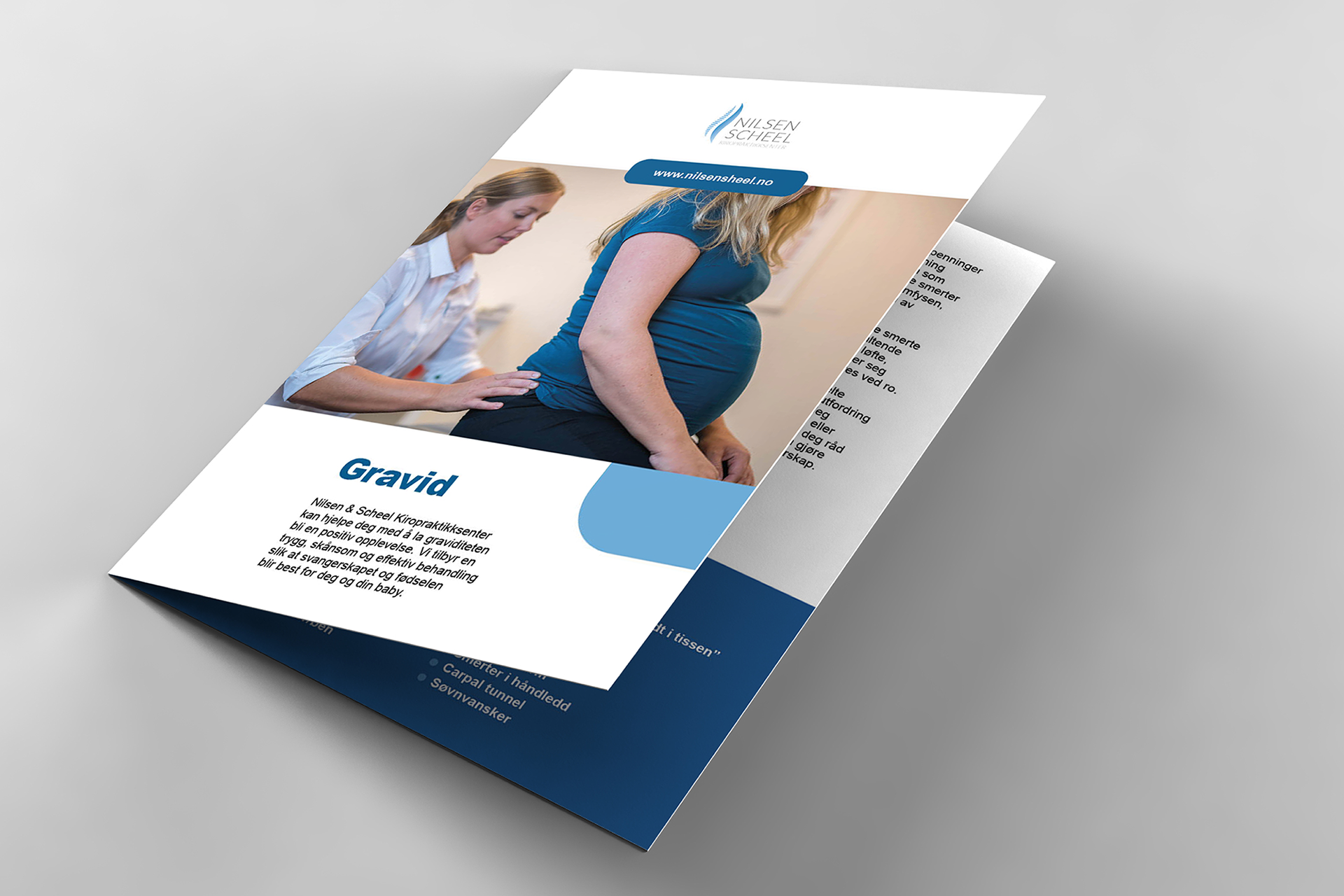
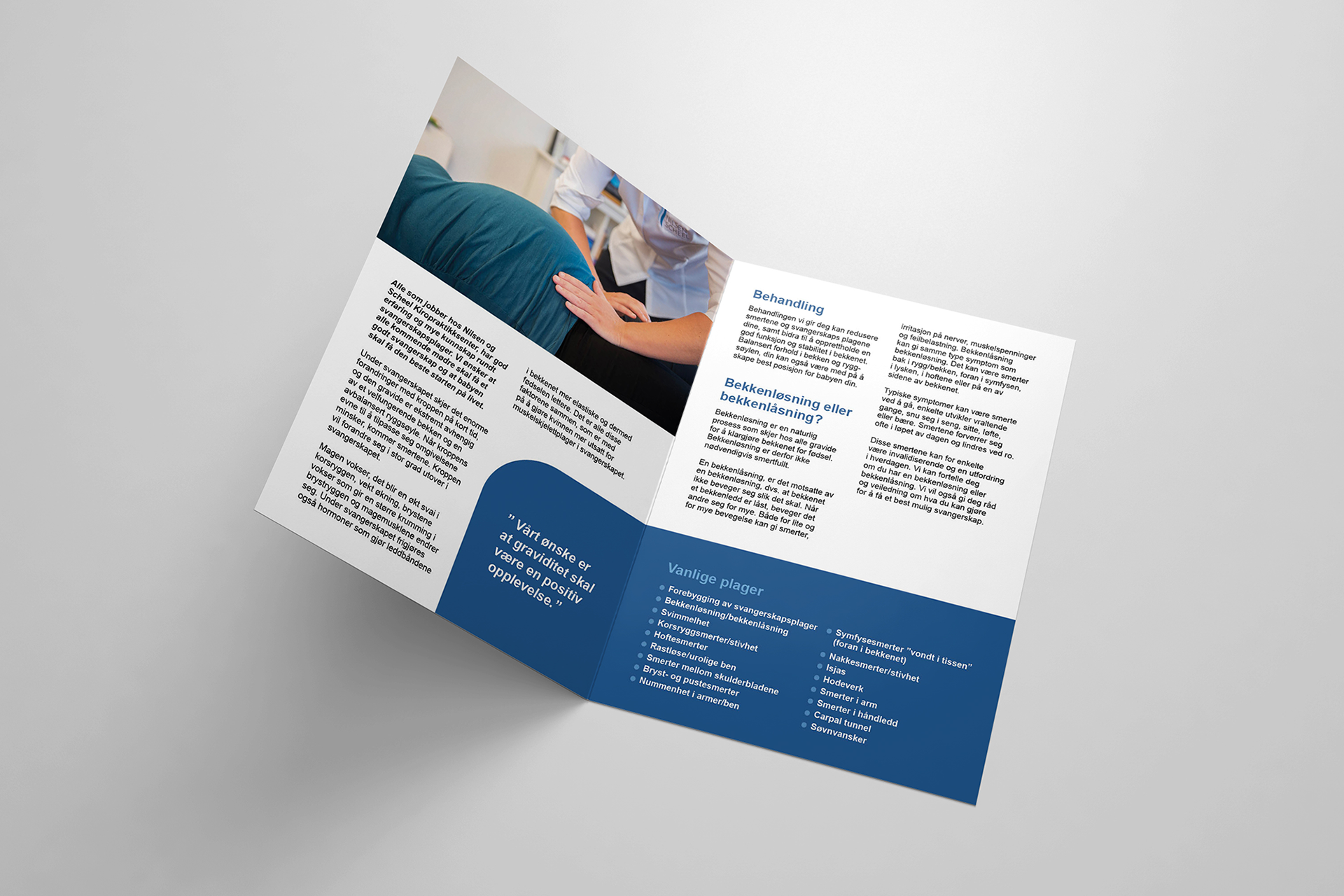
Client: Nilsen & Scheel Kiropraktikksenter
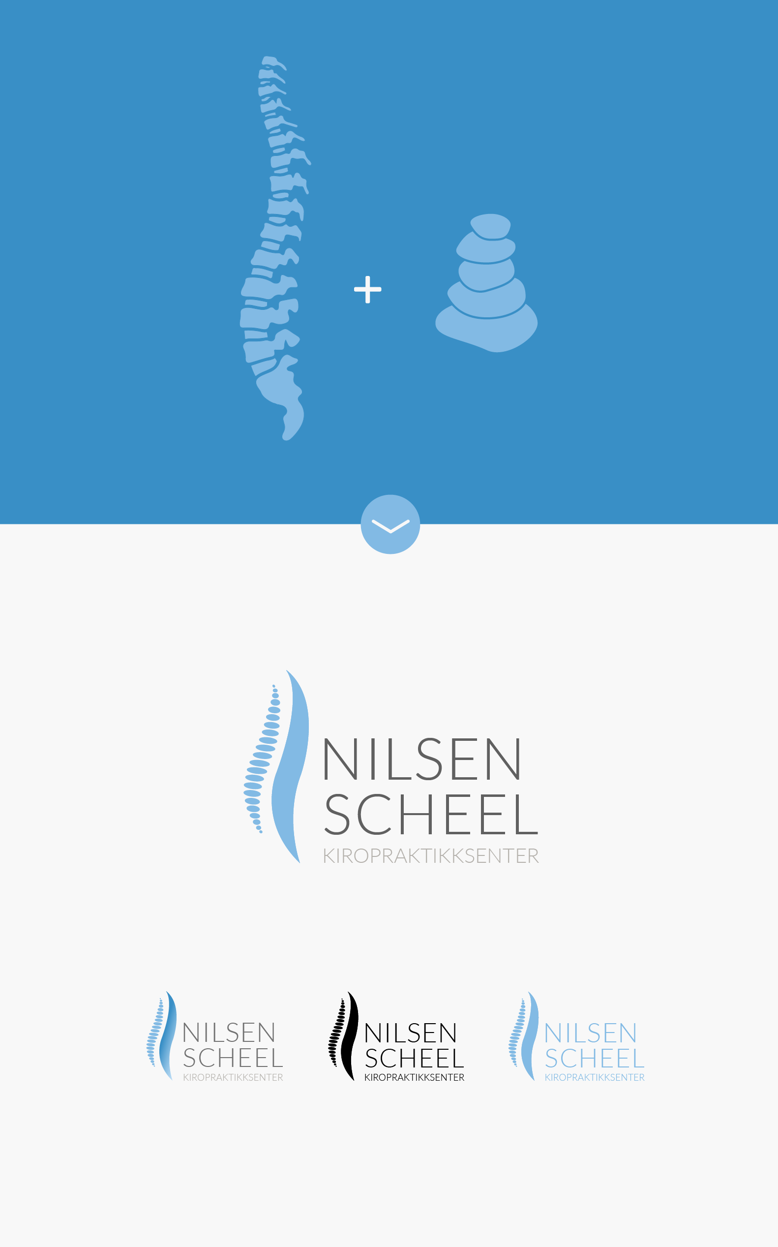
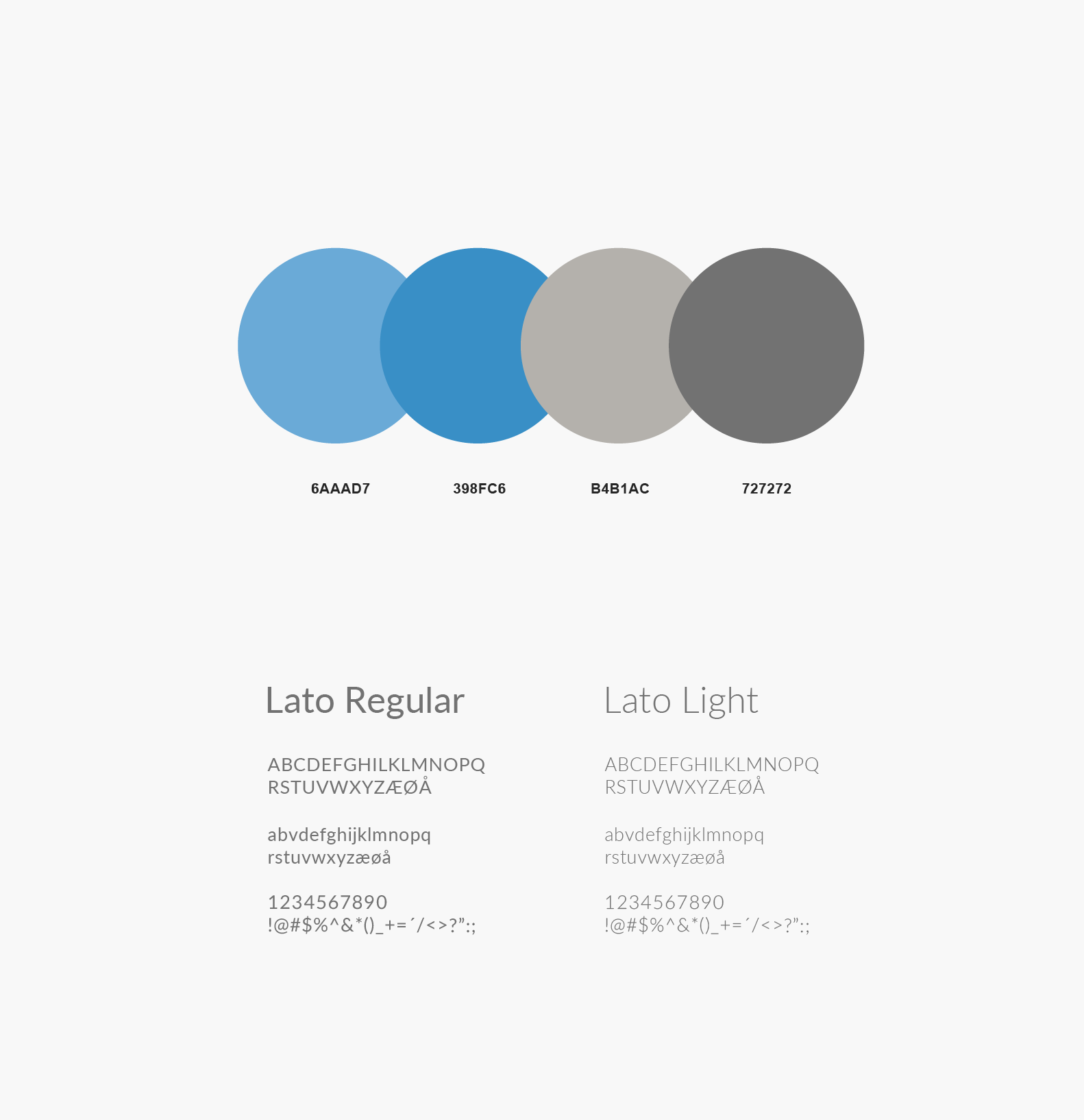
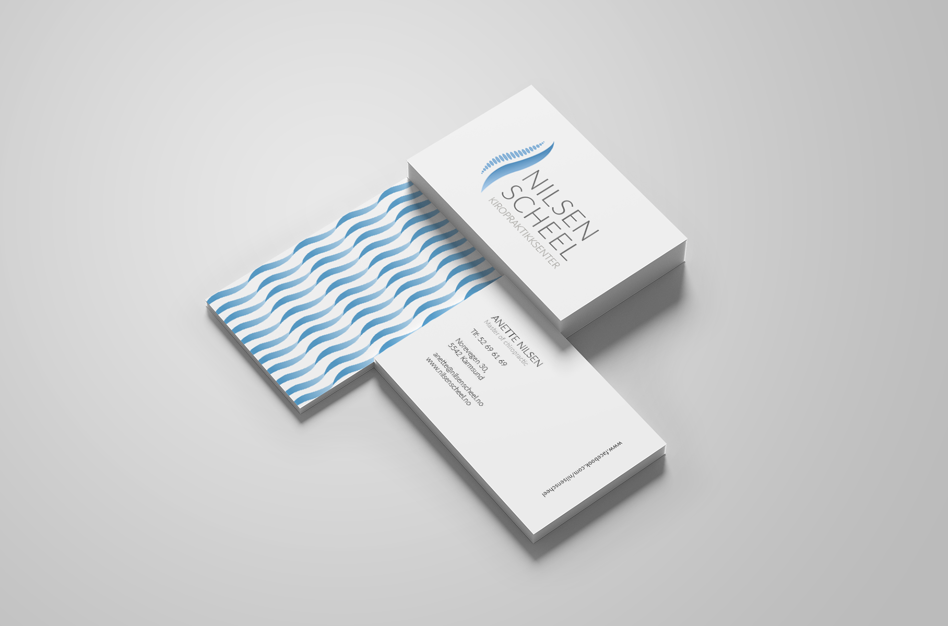
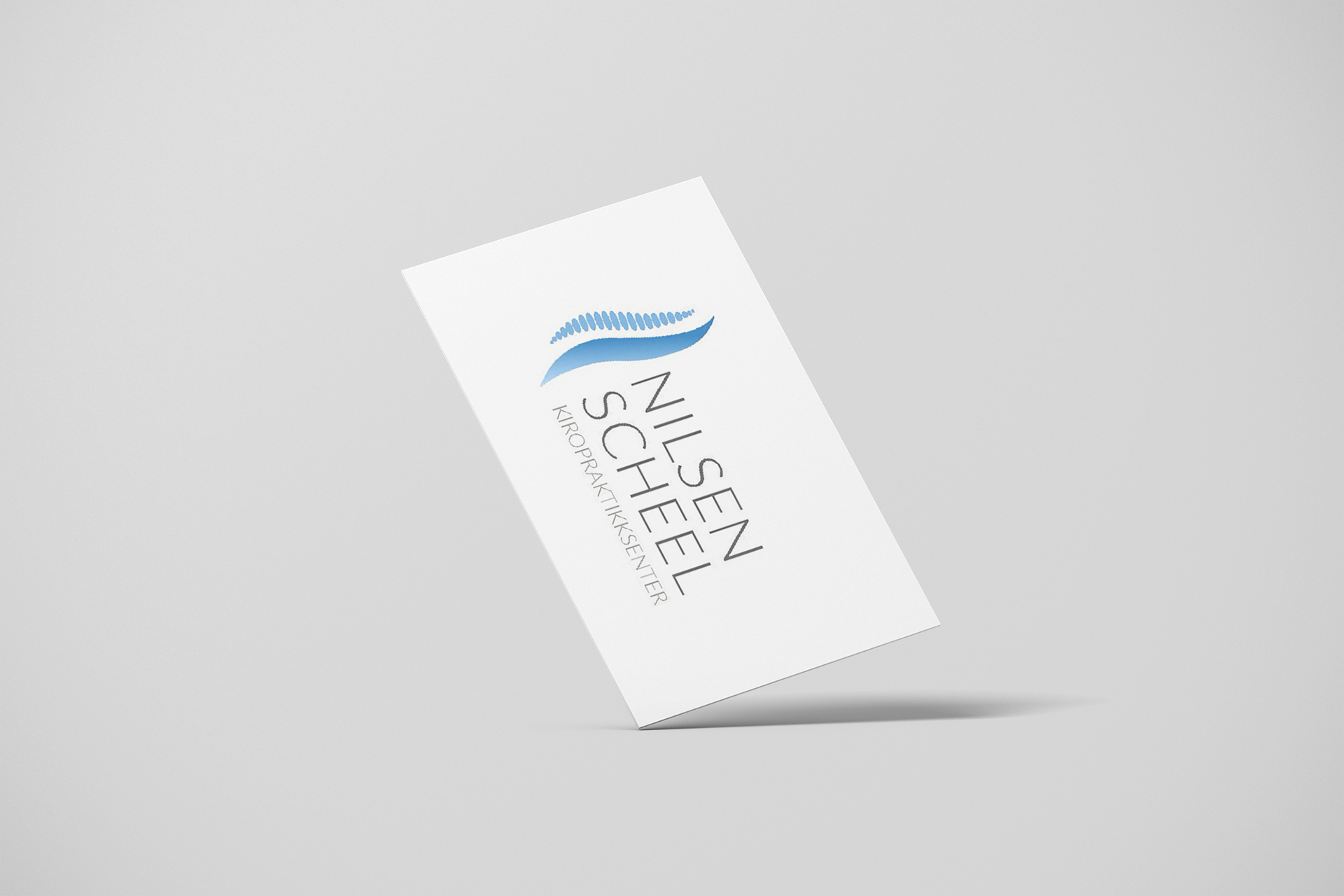
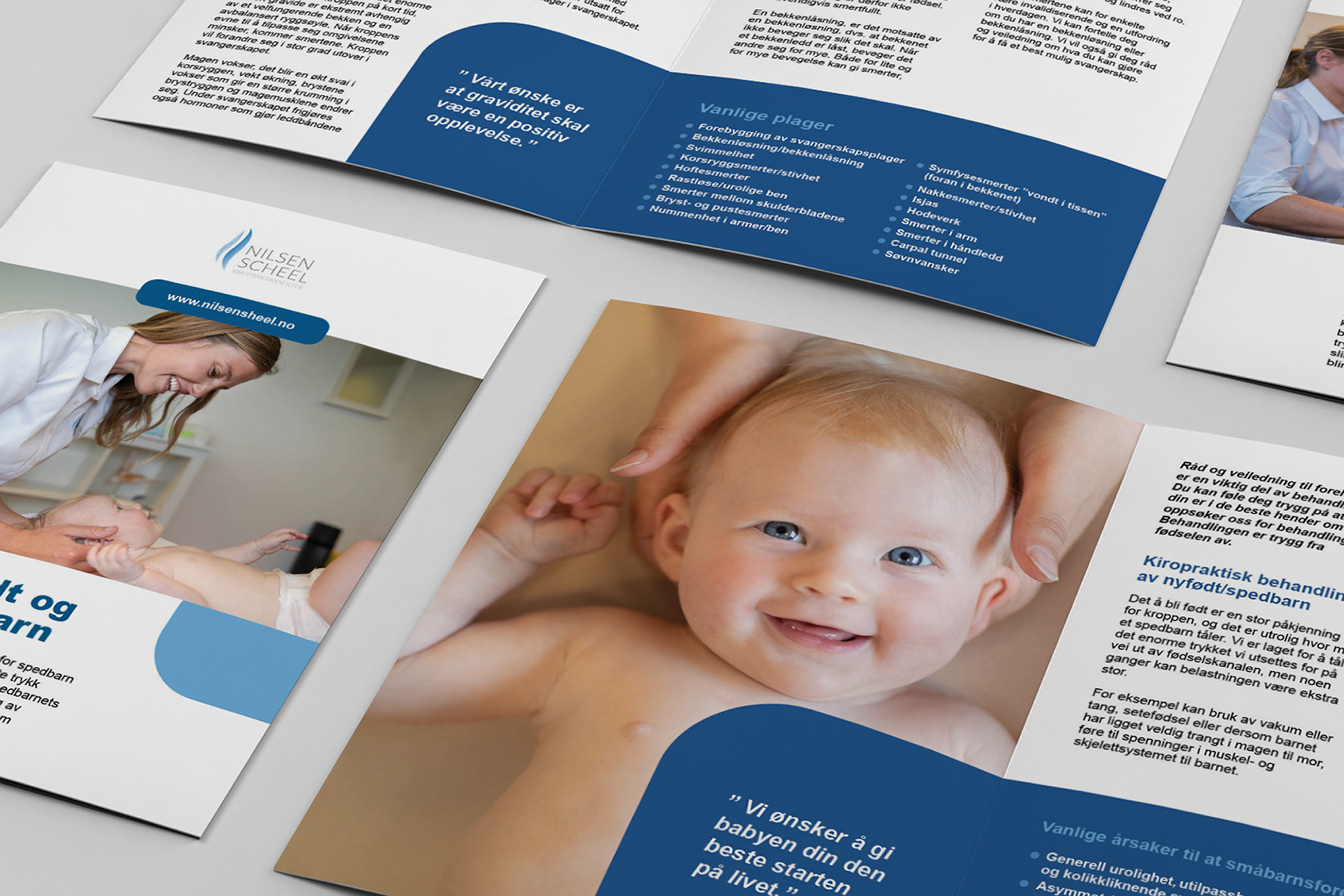
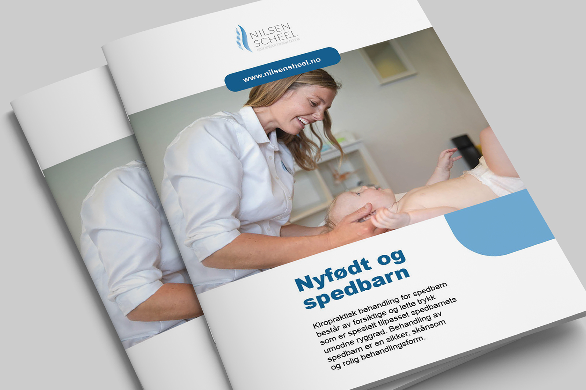
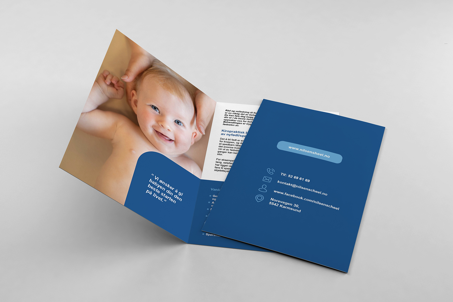
When creating the brand identity for the Haugesund based chiropractic clinic Nilsen & Scheel, the logo was inspired by the shape of the human spine combined with a symbol of calm, presented through stacked zen stones. The color palette and shapes emphasise the symbolism and the professional impression Nilsen & Scheel Kiropraktikksenter wants to convey as an health establishment. This is also portrayed through the simple designs both in the business cards and the information brochures.